Get Travelicious – Tour Operator Theme Download

Travelicious – Tourism, Travel Agency and Tour Operator WordPress Theme
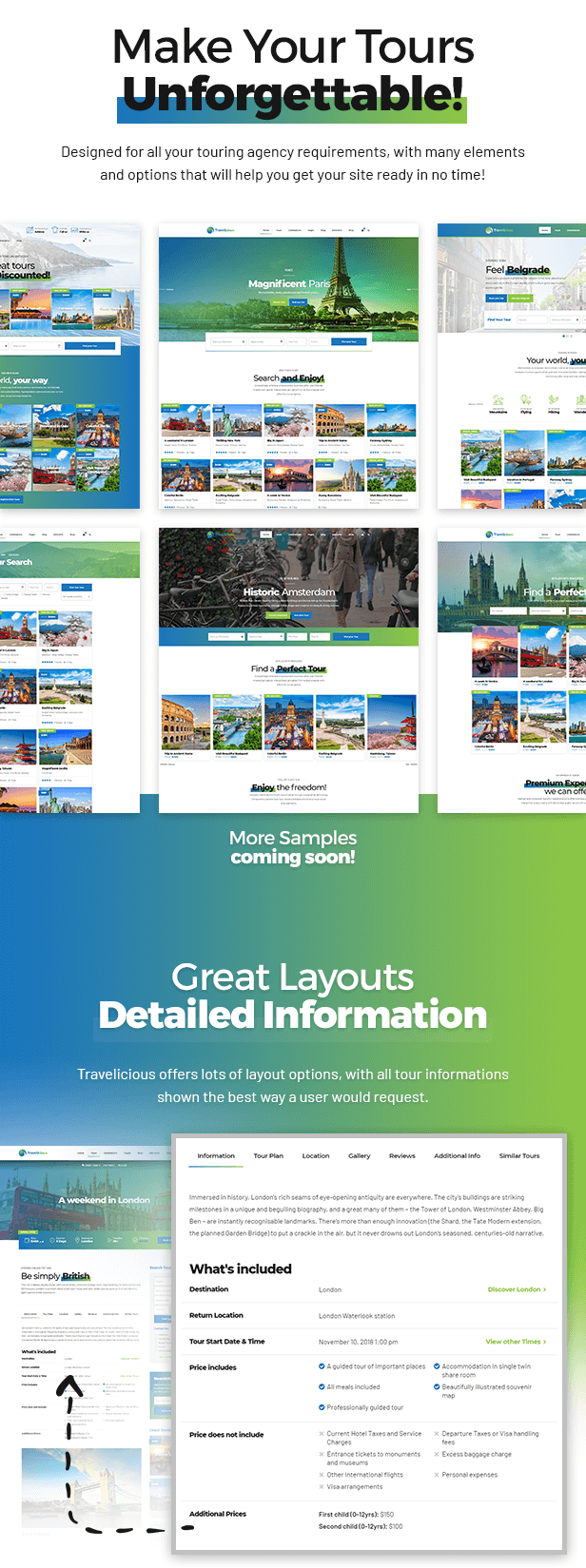
Travelicious WordPress Theme for tourism, tour operators and travel agents.This WP theme is specially designed to meet the needs of tour operators and travel agents for presenting their vast offer and to make it easy for clients to search for and to read about agent’s offer.


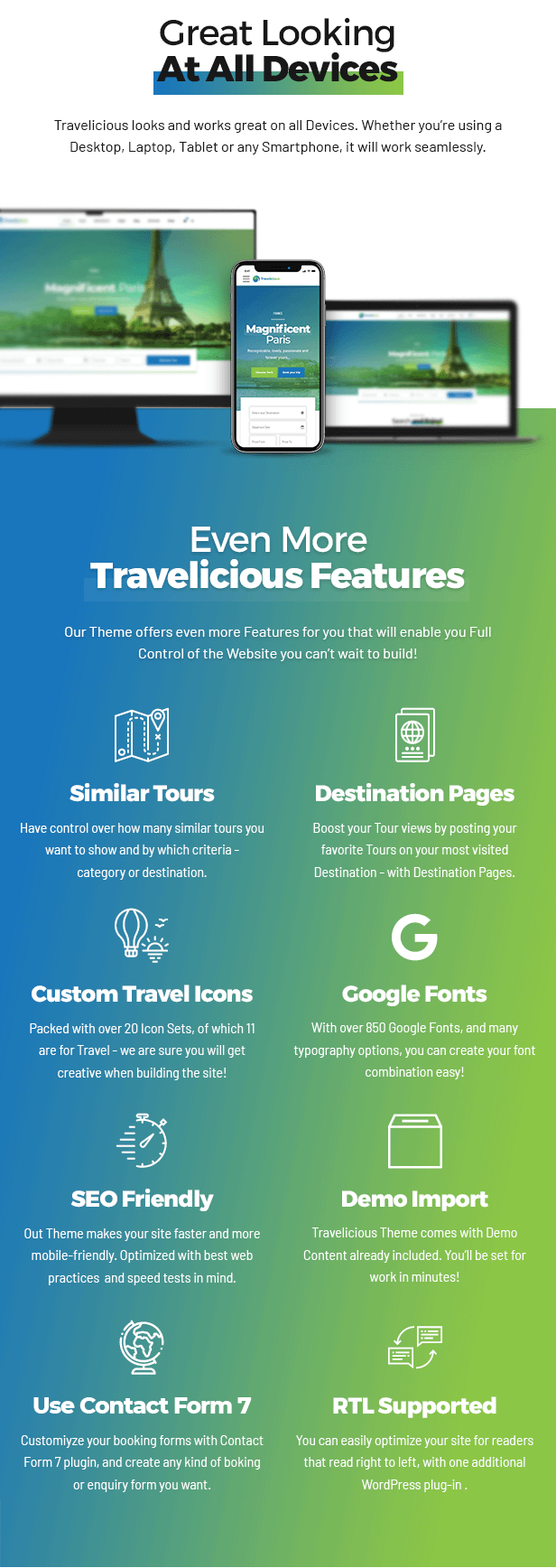
Every page is designed to look good on all devices. Travelicious WordPress Theme for tourism is responsive and retina ready.
Travelicious offers comprehensive options panel, unique page transitions and distinctive typography and highly rated customizable Cost Calculator plugin that comes free with this theme. It also includes easy to use and fast Bold page builder.


With one-click demo content importer tool you will have a fully featured website. You can then start personalizing your WordPress website through the theme options control panel, and replacing the demo content with your own.


Travelicious WordPress theme comes with free updates and free post-sales support by our highly acclaimed support team.
Feature List
- Latest WordPress version compatibility
- Well organized & clean code
- WordPress Multisite tested
- Child theme ready
- Theme options powered by native WordPress Customizer
- Translation ready
- One page support
- Compatible browsers: IE11, Firefox, Safari, Opera, Chrome, Edge
- Responsive design
- Retina ready
- Online documentation
- 24/7 customer support
PLUGINS:
Included:
- Bold Builder (http://bold-builder.bold-themes.com)
- Meta Box
- Bold Themes’ Import Plugin (1 click demo import tool)
- Contact Form 7
- Bold Themes’ Cost Calculator (https://codecanyon.net/item/cost-calculator-wordpress-plugin/12778927)
Supported:
- WooCommerce
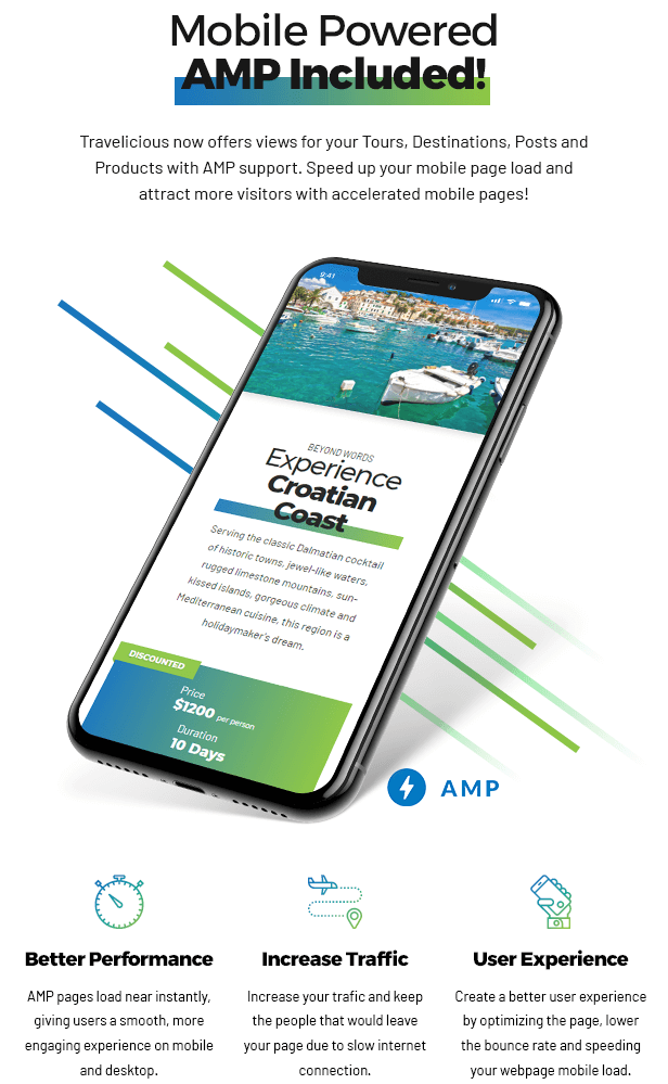
- AMP
- W3 Total Cache
- Yoast
- RTL
BACKEND EDITOR FEATURES:
- Fast drag & drop backend editor
- Responsive options
- Full clipboard functionality with copy /paste from one page to another or from one website to another
- Time limited content appearance
- Hide/appear on screen resolutions option
- API included
- Full width/ boxed layout options
- Multiple header (including sticky header) & menu styles
- Mega menu support (organizes large number of menu items)
- Left and right sidebar option
- Custom footer
- Override global settings option (change settings for individual pages)
- Color schemes
- Define colors with color picker
- Parallax effect
- Smooth transition effects
- Icon widget (e.g. social icons)
- Custom icon sets
- Google Fonts
- Shortcodes tailored for tour operator and travel agent’s websites
- 4 tour designs: regular, gallery, tile and list
- Multiple tour header designs
- Tour details: includes, excludes, destination, embedded map, gallery, tour plan, reviews, similar tours etc.
- Customizable tour search, categories, google map style, pin and more
- Under construction page design
- 404 page design
ELEMENTS:
- Accordion & tabs
- Button
- Countdown
- Counter
- Custom menu
- Masonry destination grid & tile
- Google maps element
- Headline & text
- Icon
- Image & image slider
- Instagram & Twitter element
- Latest posts element
- Masonry image grid, post grid & post tiles
- Price list
- Progress bar & advanced progress bar
- Raw html/js content
- Ribbon element
- Separator
- Service element
- Slider element
- Tour list
- Tour search form
- Tour single
- Video element
- Working hours element
Version 1.2.3 - 27 December 19
    - Fixed Google Maps
Version 1.2.2 - 18 December 19
    - Added Bold Timeline plugin
Version 1.2.1 - 26 November 19
    - Fixed Google Maps custom style
Version 1.2.0 - 24 October 19
    - Minor bug fixes
Version 1.1.9 - 25 August 19
    - Improved security
Version 1.1.8 - 16 July 19
    - Minor bug fixes
Version 1.1.7 - 4 July 19
    - Minor bug fixes
Version 1.1.6 - 20 June 19
    - Minor bug fixes
Version 1.1.5 - 1 June 19
    - Fixed Override Global Settings
Version 1.1.4 - 30 May 19
    - Minor bug fixes
Version 1.1.3 - 28 May 19
    - Fixed tabs order
Version 1.1.2 - 27 May 19
    - Added tabs customizing options
    - Minor bug fixes
Version 1.1.1 - 11 April 19
    - Fixed Google Maps
Version 1.1.0 - 8 April 19
    - Minor bug fixes
Version 1.0.9 - 27 February 19
    - Option to open search tour result in new or same tab
    - Other minor updates and bugfixes
Version 1.0.8 - 1 February 19
    - Added option to change tour category slug
    - Added option to change tour destination slug
Version 1.0.7 - 23 January 19
    - Improved CF7 compatibility
    - Demo content update
Version 1.0.6 - 22 January 19
    - Fixed PHP error
Version 1.0.5 - 21 January 19
    - Added booking link option
Version 1.0.4 - 15 January 19
    - Travelicous plugin .pot file update
Version 1.0.3 - 21 November 18
    - Fixed some minor bugs
Version 1.0.2 - 15 November 18
    - Fixed travelicious plugin version
Version 1.0.1 - 15 November 18
    - Improved AMP support

![Photo of [Download] Dante – Responsive Multi-Purpose WordPress Theme](https://moneysoe.com/wp-content/uploads/2020/03/Download-Dante-Responsive-Multi-Purpose-WordPress-Theme.jpg)